
My Writing Process Series
- Part 1: Intro
- Part 2: Tools of the Trade
- Part 3: Taking Notes
- Part 4: Plotting
- Part 5: The First Draft
- Part 6: Editing…or the Second Draft
- Part 7: Editing…Part 2
- Part 8: Formatting
- Part 9: Cover Design ← You Are Here
Howdy Freeholders!
It’s time for another episode in my series of how I publish books from start to finish. Last week we talked about how I format my books for not only digital but print. Today’s post deals with the most immediately visible part of my writing process, and some would argue the most critical as well.
Creating a cover for a book is…well, it’s an art form and it’s just plain fun (for me, but I liked to draw a long time before I liked to write). So how do I do it?
What makes a cover?
Usually, I’ll create my cover sometime after I’ve written about three quarters of the book, so that as I wrap up the book, the cover is almost finished, or will be quickly ready to go as soon as I’m done editing. Covers are a tricky thing, because what works for Amazon might not work for Google, or Barnes & Noble, or…you get the idea.
Typically I used to make a cover that works for Amazon, then copy it into everything else, adjusting size as needed to fit the specifications required by the different distributors. Going back for a moment to talk about last week’s post on formatting with Vellum, you take your you take one image file, and the program will adjusted to fit the specifications of any vendor you want.
I only mention it again here, because Vellum is enormously convenient and since I started using it, the days of me having to create multiple cover files are thankfully long gone.
Procreate

I create my covers on my iPad Pro using an app called Procreate. It’s a fantastic app on the iPad. I start with a general background, then depending on what series it is, I have to remember to throw in certain aspects. For example, on a Wildfire series book, every cover has a biohazard symbol somewhere on the cover, whether it’s the prominent part of the cover like an Apache Dawn, or hidden as a tattoo on a main character, as in the Regent, that little symbol is on every single cover. For other series, like Solar Storm, I simply took the main image and change the title to reflect what book number it was.[1]

In the Elixir Plague series, the main element of each cover was the black background prevalent on each book. The image on the cover changed whether it’s in acts or a character, or one of the zombies, and so it tied every one of the covers together.
What’s the process?
Now, I can’t really say there’s an exact process I use for each one of my covers, but they all end up working out about the same. I start with the background layer I will I work in layers.
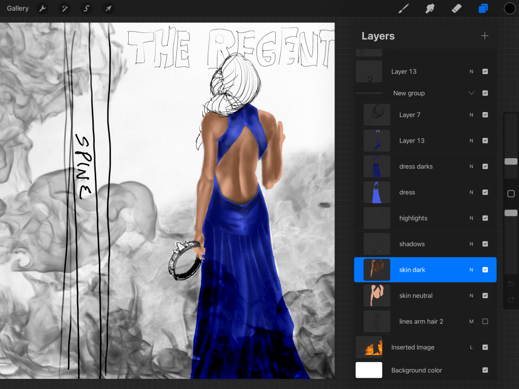
I find it much easier to manipulate individual aspects of the cover by separating them all out into layers so that I don’t affect the rest of the image. For example, I will have a background color—usually black—upon which I’ll place the main image that I want to represent the book. Over this, another layer becomes a title the title becomes another layer.
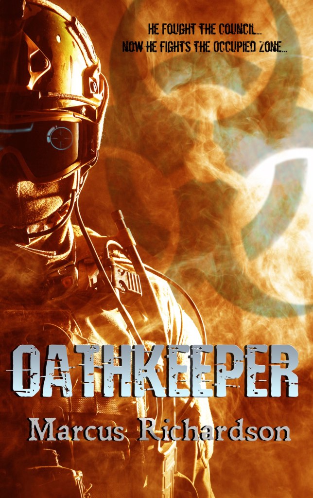
Sometimes I’ll even make the subtitle a separate layer. Then individual effects that go into changing the way the main image looks, whether it be aglow, or crackling energy, or in the case of Oathkeeper, digital enhancements were added as a separate layer over Cooper’s helmet to give a futuristic look to modern-day equipment. Each one of these layers is then adjusted with the myriad tools available in procreate, and when I’m done I flatten everything down to form one final image.
I used this process for all my books, except for the ones created with other people. The Shadow Wars series, and all the series I’ve written with Mike Kraus all had covers created by someone else.[2]
Among the books I’ve written solo and created the covers, the only one that’s unique is The Regent, in that it was fully illustrated. This is the only book cover that I’ve used that I’ve made without including photographs — manipulated or otherwise in the cover process. Every other one of my books, even Apache Dawn and The Shift, use elements that I either purchased or acquired elements I either purchased or acquired through Creative Commons usage to make the cover.
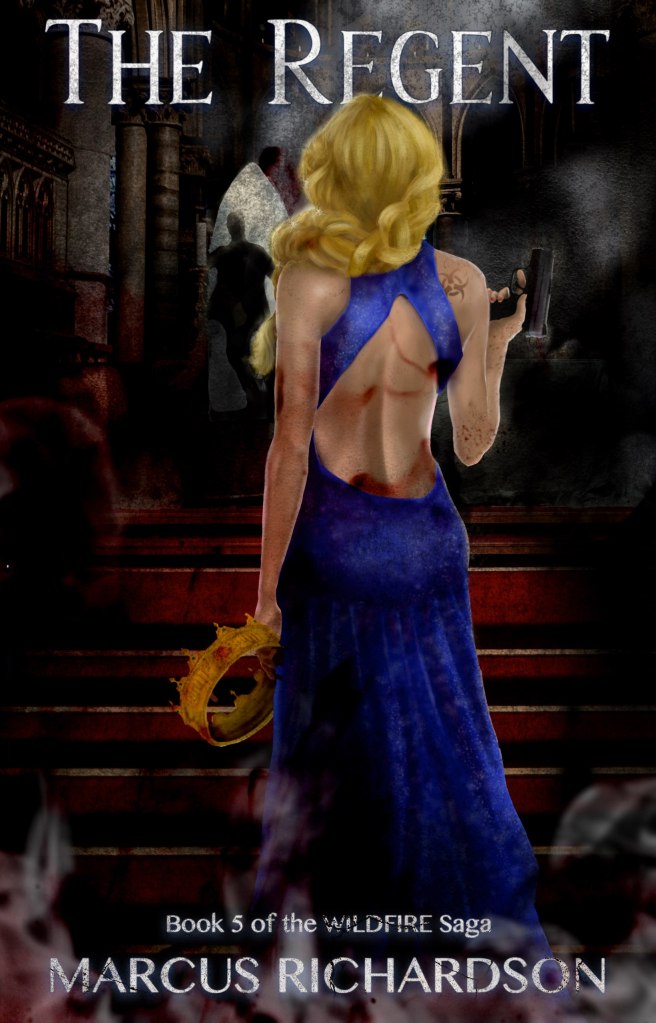
The Regent was completely illustrated by yours truly. I sketched out the image, and layer by layer built up the character—Jayne—through skin texture, to her dress, and even the gun. This was the most intricate, time-consuming and detailed cover I’ve ever done, and it ended up with something like 30 or 40 layers.
It took me almost a month working—here and there—around editing and writing the book to finish the cover. But, it was the most satisfying cover I’ve ever made. It was inspired in part by the trip Mrs. Richardson and I took to England for our honeymoon (to England and Scotland). We visited her old college of Oxford and went up on top of St. Mary’s where there was a very narrow pathway on the spire.
That narrow, windy pathway inspired me to render the arch in the background on the cover, where figure is seen running away from Jane, who stands proud and prominent in the middle of the scene, holding both the crown that belonged to the True King.
Where do I get the ideas for cover design?
The best and easiest way to figure out if your covers going to work with your genre is to go to the retailer of your choice and look at the top 20, top 50, or top 100 covers in your particular genre. See what’s selling, see what patterns you can find. Then try to emulate—not copy—winning strategies.
When I first started writing, cover designs in the thriller/post-apocalyptic genres were kind of all over the place. Other authors had silhouettes of people on the cover, some had illustrated covers, still others had solid colors or very modern, stark designs.

There was no overarching theme. So I went with what I liked and created the covers for Alea Jacta Est and Apache Dawn.
Nowadays, if you go look in the post-apocalyptic category on Amazon, you’ll see many of the same cover styles repeated over and over again: a background of post-apocalyptic chaos, with the silhouette of a character on the front, or several characters facing away from the reader, viewing the devastation taking place in the distance.
There’s a reason why so many covers look that way—it works, and it sells books! Case in point, look at the cover designs of the books I wrote with my partner Mike Kraus over the last four years. When I wrote my solo books, this advice didn’t quite apply because the market was so crazy (it was still the Wild West days of digital publishing), but over time, the cover designs have solidified into a homogenous, recognizable, pattern.
Here are the covers to the first in series for each of the last 3 series I’ve written (with Mike Kraus):
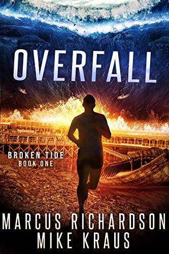


Note: these covers were NOT made by me (which is why they look so good lol)
Paperbacks
So you can see with an iPad, one app, and access to photographs or creating drawings from scratch, the physical act of making a cover is much easier when broken down into small parts—and layers.
Paperback books, however are different beast. Physical covers have to take into account the spine and the back cover. This creates a rectangular image that allows the creator to play with whatever action needs to be on the back, as well as the text and graphics on the spine.
Amazon makes this easy, and I’ll get into this in a later blog post, but they allow you to download a template for the paperback cover for the size of book that you wish to create. The page count determines the size of the cover—thinner books with less pages will have a skinnier spine and therefore less space to put graphics and words. Bigger books—like the doorstoppers I write—tend to have a healthy spine which allows me to put a few small graphics along with my author name and any other information like the series number, etc.

Creating a paperback cover also involves a lot more text is you’re able to put reviews, a synopsis, or blurb (or all three) on the back cover, along with a picture of the author, all while leaving space for the ISBN and UPC code. It’s a little tricky, but the same principles apply as for creating digital book covers. Once again, I add all of these files, and Vellum spits out a perfect, complete book, with properly designed covers (digital or paperback) per the distributor specifications.
It really is a lifesaver.
The first few books that I tried doing this with, when I first went wide, took forever and the process was a hot mess. I had to try and tweak individual files six different ways from Sunday, for five different retailers.
On each and every book.
It was a nightmare. But I’m so glad that I found Vellum after that because I look forward to cover design and formatting and producing the book now. So that’ll wrap it up for today. Next time I’ll go over the actual publishing process and how it differs between being exclusive and going wide.
Until then, keep your heads down and your powder dry my friends. We live in interesting times.

Notes
[1]: I received a lot of positive feed positive feedback about the Solar Storm covers. People liked that they could recognize any books in the series by number at a glance. It’s something that I may consider doing again in the future.
[2]: The series I’ve written with Mike Kraus are: Broken Tide, Lost Sanctuary, and most recently, Ravaged Dawn.

Leave a reply to Writing Process: Marketing (part 1) – The Freeholder Press Cancel reply